Two weeks ago, we wrote about the latest long range model forecasts, and what they show for the upcoming winter 2019/2020. While we wait for the latest October model updates, we will take a more statistical approach to seasonal forecasting.
Statistical forecasting is exactly what it sounds like. We analyze the global climate data, and use that data to try and find a possible trend for the future. Every year, we have a rather unique global pattern configuration, which gives certain seasonal results. These results are the weather itself, which we can feel and measure (on most occasions). The statistical method is purely experimental, and has varied results, but it is always interesting to look at, to see if perhaps the past can teach us something about the future.
What we will be doing, is looking at the current global configuration of different indices, and try to find years in the past, with similar global development, to look how winters in those years have turned out across the Northern Hemisphere.
What are we looking at?
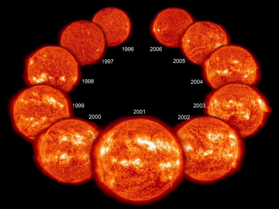
Since there was a lot of talk lately about the current solar minimum, we decided to take a look at the 11-year solar cycle. This is actually a cycle of the Sun’s magnetic field, where the Sun goes through a magnetic pole reversal, flipping north and south magnetic poles. That causes all kinds of activity and anomalies in the Sun’s magnetic field, which is easily observable on the Sun’s surface as an increase in sunspot numbers.
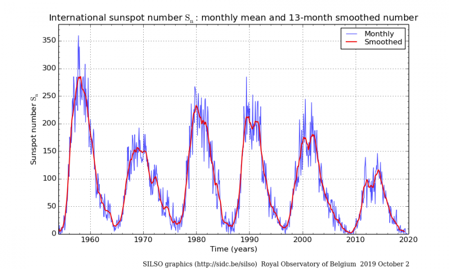
From the SIDC data, we extracted the years during solar minimum, with the focus on sunspot number below 50 in autumn and early winter, which corresponds to our current conditions. We are currently near zero in monthly values of SSN, but we are focusing on the phase itself, not to find accurate solar numbers, which would give a low sample size. The periods we extracted, are 1973-1977, 1983-1987, 1994-1997, 2004-2010 and 2016-2018. Below we can see the solar cycles through the last decades, and the current solar minimum. The solar cycle is observed by the total sunspot numbers (SSN), or better by the F10.7cm Radio Flux.
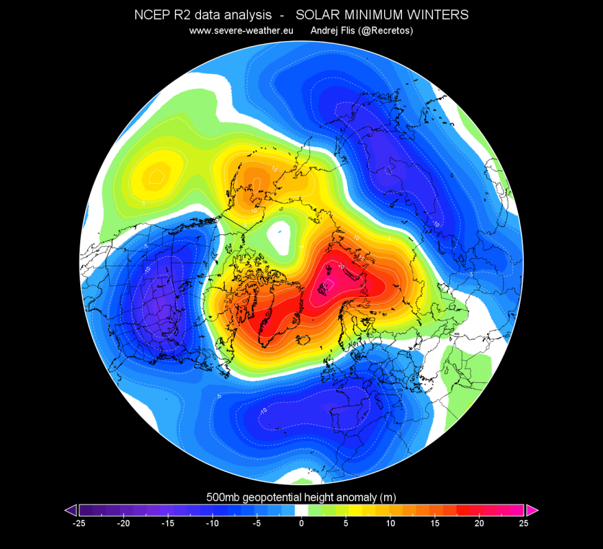
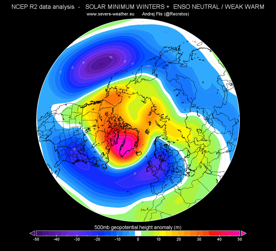
Now, we take the historical re-analysis data, from NCEP, to create a graphic of how the average weather pattern looked like in winters during these periods. Obvious right away are positive anomalies over the north pole. This corresponds to higher pressure. And opposite for negative anomalies. This is a typical negative NAO/AO pattern, which brings colder (and snowier) conditions into Europe and North America.
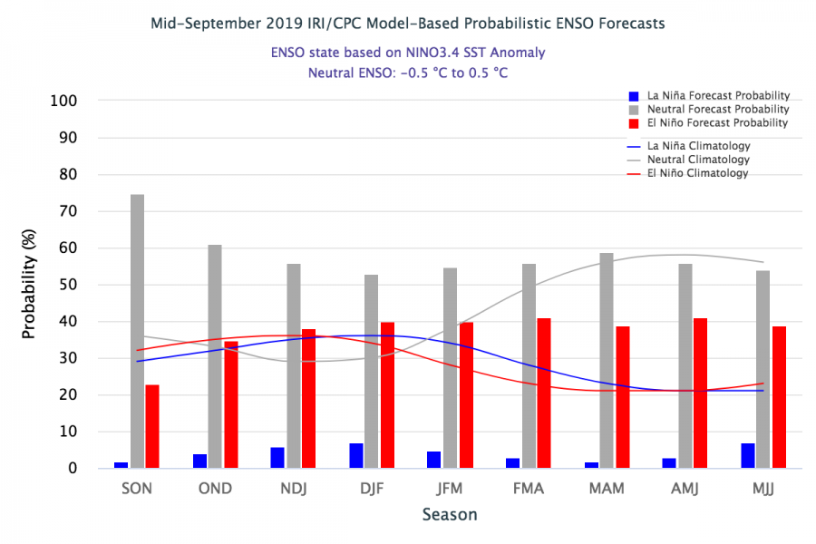
So far so good, you could say, if you live in mid-latitudes and if you like winter weather. Well, not so fast. Obviously, there is much more to this weather pattern than just solar influence. It is even hard to tell how much of this pattern really is solar influence, since we already have our chaotic climate that plays a game of its own. There is a lot of climate variability in these periods. That is a term worth remembering. A very well-known climate index is the ENSO (El Niño – Southern Oscillation). It is one of the most well-known global drivers, with its warm phase (ElNino) and cold phase (LaNina) in the tropical Pacific, alternating warmer and colder waters. It is perhaps more of a response/indicator of the global state (a control light) rather the actual direct influence on its own. But more on ENSO perhaps in a future post. ENSO is currently forecast to remain in a warm to neutral state in the next 6 months, with low probability for a proper warm phase developing. So we will have to remove all the cold phases, and strong warm phases of ENSO, to get a more appropriate picture, and focus on neutral and weaker warm phases.
After removing all the cold phases and strong warm phases of ENSO, we get a very interesting and more defined picture. We see a high pressure area focused over Greenland and the Arctic, typical for negative NAO & AO. Lower pressure is displaced a bit further south, along with polar fronts and colder air. This type of pattern usually brings colder and snowy weather to Europe and USA. If you love winter and you want snow, and you happen to live in Europe or USA, this is what you want to see in the forecasts. The problem we have, is the large low pressure area in North Pacific. That is a more typical feature for a proper stronger ElNino, and is completely opposite of what the latest long range model forecasts are calculating.
singlepic id=10446 w=900 h=800 float=center]
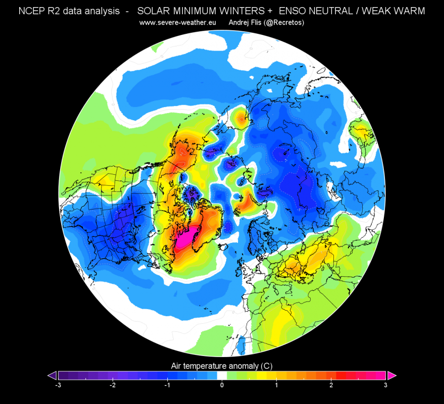
Looking at the surface temperature anomaly, we see colder air in eastern and central parts of USA and north Europe. What stands out is a positive anomaly in southeast Europe and parts of central Europe. This is due to the southern shift of low pressure systems, centering over west/central Europe. On the east and south-east side of low pressure systems, we usually find south/southwest winds and warmer air, but also more precipitation, like we see in south/southeast Europe in these graphics. But the pressure patterns have more significance in statistical forecasting, compared to just temperatures, and the pressure pattern in the graphics above, is more favorable for Europe than what the temperature chart suggests. A similar pressure pattern was in January-February 2013, or in winter 2009/2010.
Summary:
So, what does history tell us? It shows us that solar minimum years and moderate positive ENSO is a good combination for winter lovers in Europe and USA. But what it fails to mention is, that we are looking at only two parts of the whole equation. There is much more than just the Sun and ENSO that influence our weather. There is an endless list of things that influence our climate, both major and minor. We are only looking at two pieces of the puzzle. Tho statistical forecasts can be useful as a guidance, there is consensus that it is better to look at actual model calculations, because they tend to look at the entire world in real time, rather than from a historic perspective.
Nonetheless, the statistical forecast is optimistic, and there have been situations when they proved to be superior. This year though, the long range models are forecasting an unusually similar picture, which increases the confidence in their forecast. We will soon take another look at the updated long range model guidance. Are the new calculations looking more similar to their statistical counterparts? Or are they firmly set on a milder pattern? Stay tuned to find out!
