New Winter 2026/2027 snowfall predictions are starting to show a strong Super El Niño signature, with clear regional differences visible across the United States, Canada, and Europe. The latest September forecast update shows a better view of where snowfall could run above or below normal during the coming season.
The developing Super El Niño will be the major global driving force in the coming months, reshaping the Pacific jet stream and winter storm tracks. Historical data gives us a good idea of how a super event can shape the winter weather, with the latest forecast data starting to show those same signals for Winter 2026/2027.
In this article, I will first look at the latest Super El Niño development and the past snowfall patterns, and then I will break down the new Winter 2026/2027 snowfall forecast. But further below, I have prepared a new Snowfall Explorer interface. There, you can check the latest seasonal or monthly snowfall maps for your own state, province, country, or broader region across the U.S., Canada, and Europe.
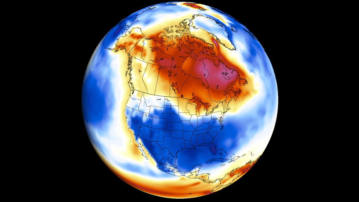
Super El Niño 2026: Building the Winter Snow Pattern From the Ocean
We continue to track the growth of a Super El Niño event, as it will be a major global weather driver for 2026/2027. This event is an area of strong above-normal ocean temperature in the ENSO region in the tropical Pacific.
The latest NOAA CRW ocean analysis below shows the ENSO area covered in substantial warm anomalies. Peak warm anomalies are found in the eastern parts, now reaching more than 6 degrees above normal (11°F) over a large area. This is an exceptionally strong anomaly and an indicator of the strength of this event.
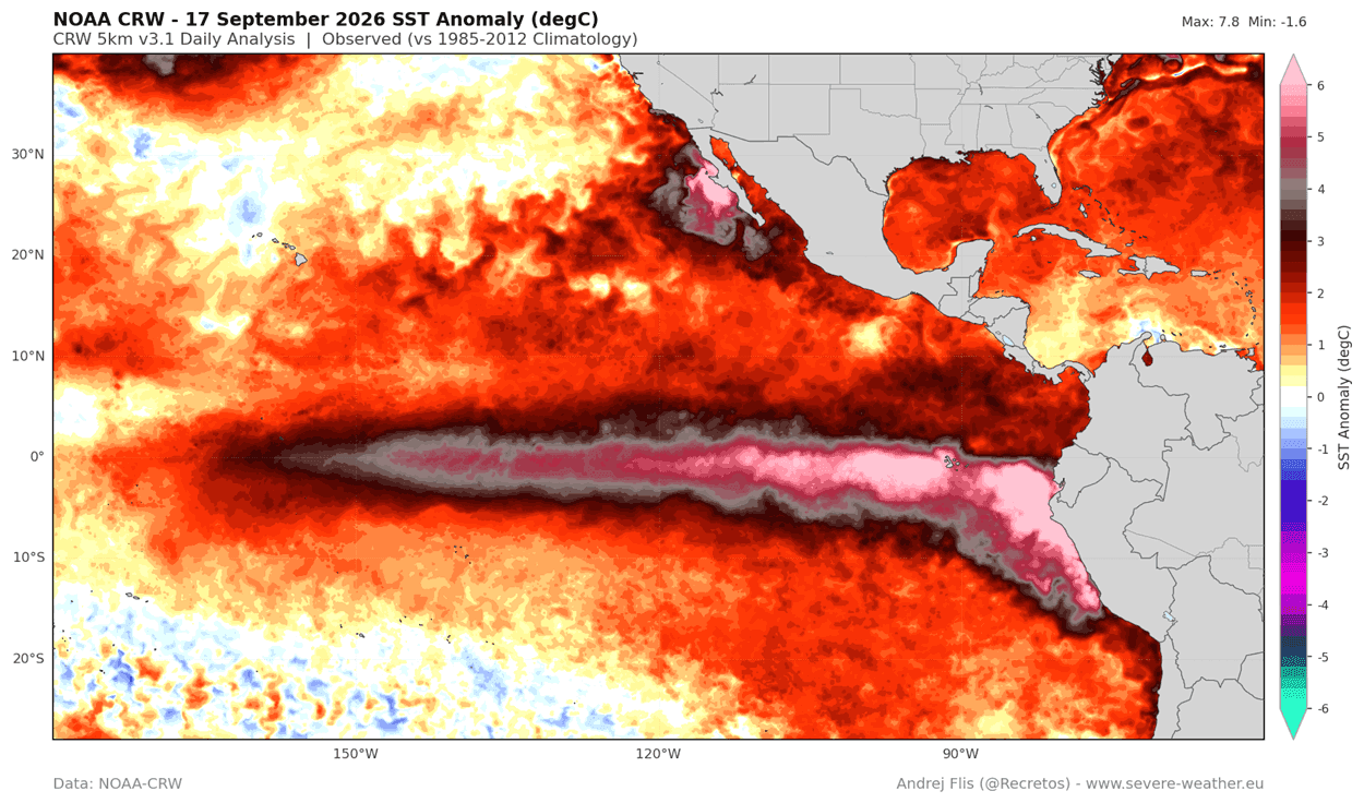
But very strong surface anomalies are only half the story. The true driving force behind this rapid warming and Super El Niño development is found deep below the ocean surface.
Below you can see the subsurface temperature anomaly across the tropical Pacific in the top 200 meters (650 ft) of the ocean. This reveals the core force of the 2026/2027 Super El Niño event: a powerful downwelling Kelvin Wave, with peak anomalies over 9 degrees (16°F) above normal. It is pushing eastward and rising toward the surface.
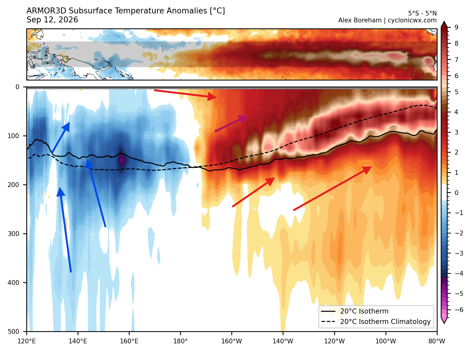
In simple terms, the ocean surface anomalies are just the surface footprint of this massive subsurface warm core. It provides a continuous supply of thermal energy to keep the El Niño strong and healthy on the surface, lasting well into the winter season.
I produced a video below that shows the development of subsurface temperature anomalies in the past weeks. You can see clear movement and growth of this large Kelvin Wave and its eventual rise as a Super El Niño in the eastern parts.
Based on the latest forecast data, this El Niño event is still far from its peak strength, which NOAA already confirms will reach extreme levels, with effects to follow.
El Niño Forecast: Peak Strength Ahead of Winter 2026/2027
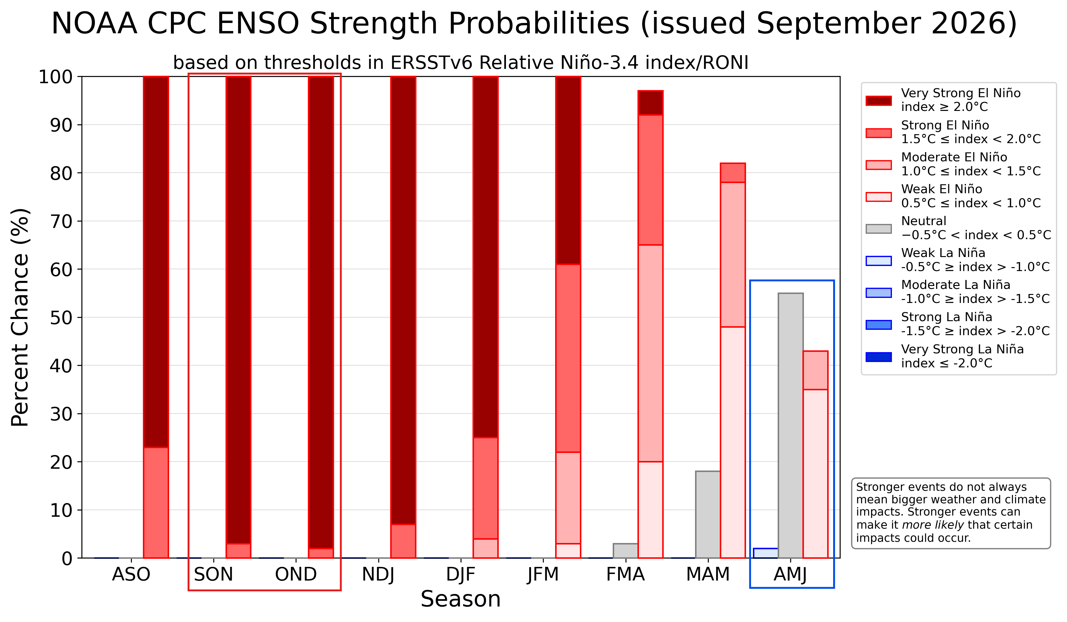
Below is the latest ENSO strength probability from NOAA CPC, which also shows the likelihood of a very strong El Niño event, peaking in late fall and early winter. You can see an overwhelming support for this event to reach the extreme El Niño category. Also note the rapid weakening of the El Niño, which NOAA expects next summer.
To get an idea of the Super El Niño at its peak strength, we can look at the North American Multi-Model Ensemble (NMME) forecast. It shows a significant Super El Niño event peak in the October-December period, with the El Niño anomaly exceeding 4°C (7.2°F) over a large area.
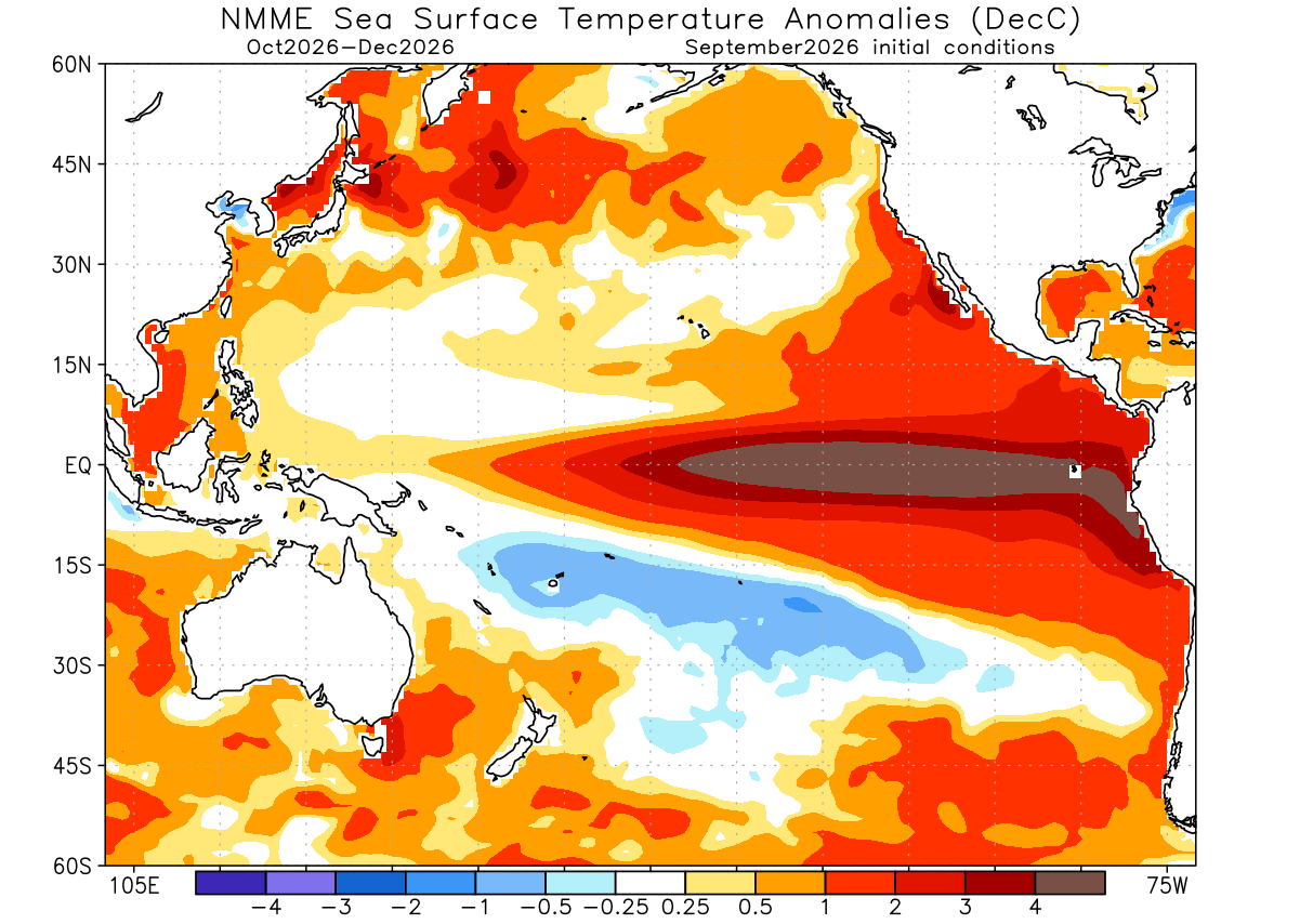
Most El Niño events peak in late fall or early winter, like the forecast above also shows for this year. And since this is a massive oceanic event on the doorstep of North America, it will bring strong winter snowfall pattern anomalies into the United States and Canada.
Super El Niño Snowfall Patterns: What Past Winters Show
Usually, the impact of these ocean anomalies comes with changes to the jet stream. The jet stream is like a large river of air at around 8-11 km (5-7 miles) altitude. It brings moisture and precipitation, so it has a significant effect on snowfall patterns.
In the image below from NOAA Climate, you can see the average position of the jet stream during El Niño winters and the resulting weather patterns over the United States and Canada. What stands out is the stronger Pacific jet stream across the southern United States.
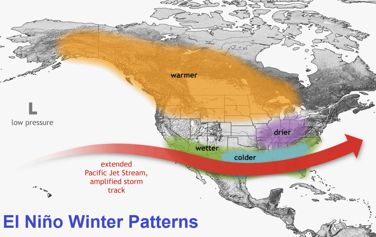
An extended Pacific jet stream brings along lower pressure, cooler temperatures, and more moisture. This combination can really increase the snowfall potential across the central and eastern United States, if enough cold air is available.
The jet stream changes also shape the snowfall patterns. Below is a NOAA snowfall composite for all moderate and strong El Niño events. Above-normal snowfall (blue) was recorded across the Sierra Nevada, the Four Corners, the Southern Rockies, and over parts of the Central Plains and into the South and parts of the eastern United States.
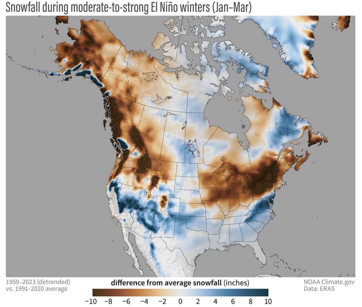
Large snowfall deficits (brown) were recorded over the Pacific Northwest, the Great Lakes, and the Northeast. This shows that despite a good jet stream position, the warm Canadian ridge limits cold air intrusions and can suppress sustained northern storm tracks.
A Super El Niño also tends to bring snowfall deficits over Europe, specifically over the northwest, southern, and north-central regions. The main reason is a mild westerly flow from the Atlantic and a rising southerly ridge, keeping temperatures too high to support widespread snow cover apart from elevations.
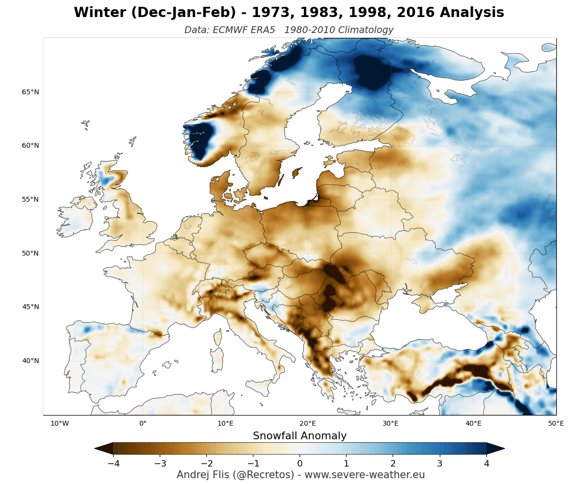
These are just examples from real past El Niño data, especially valuable over the United States and Canada, which are more directly affected. Each year has its variations of the winter pattern, so the final winter never develops exactly like some multi-year average.
For proper trend and snowfall signals, we can look at the latest snowfall predictions, issued this month (September). I also prepared a full regional and state/country Snowfall Explorer further below, where you will be able to explore the latest snowfall forecasts for each small part of the United States, Canada, and Europe.
But first, a quick overview of the latest trends in the new data.
Winter 2026/2027 Snowfall Predictions: September Forecast Update
Before we go on to the full Winter 2026/2027 snowfall map explorer, we can look at what the latest data actually shows overall in a brief look. I decided to use the ECMWF data, as it has performed the best so far in my years of experience.
You will first see the average snowfall pattern for the whole seasonal period, with one example of the snowfall explorer maps.
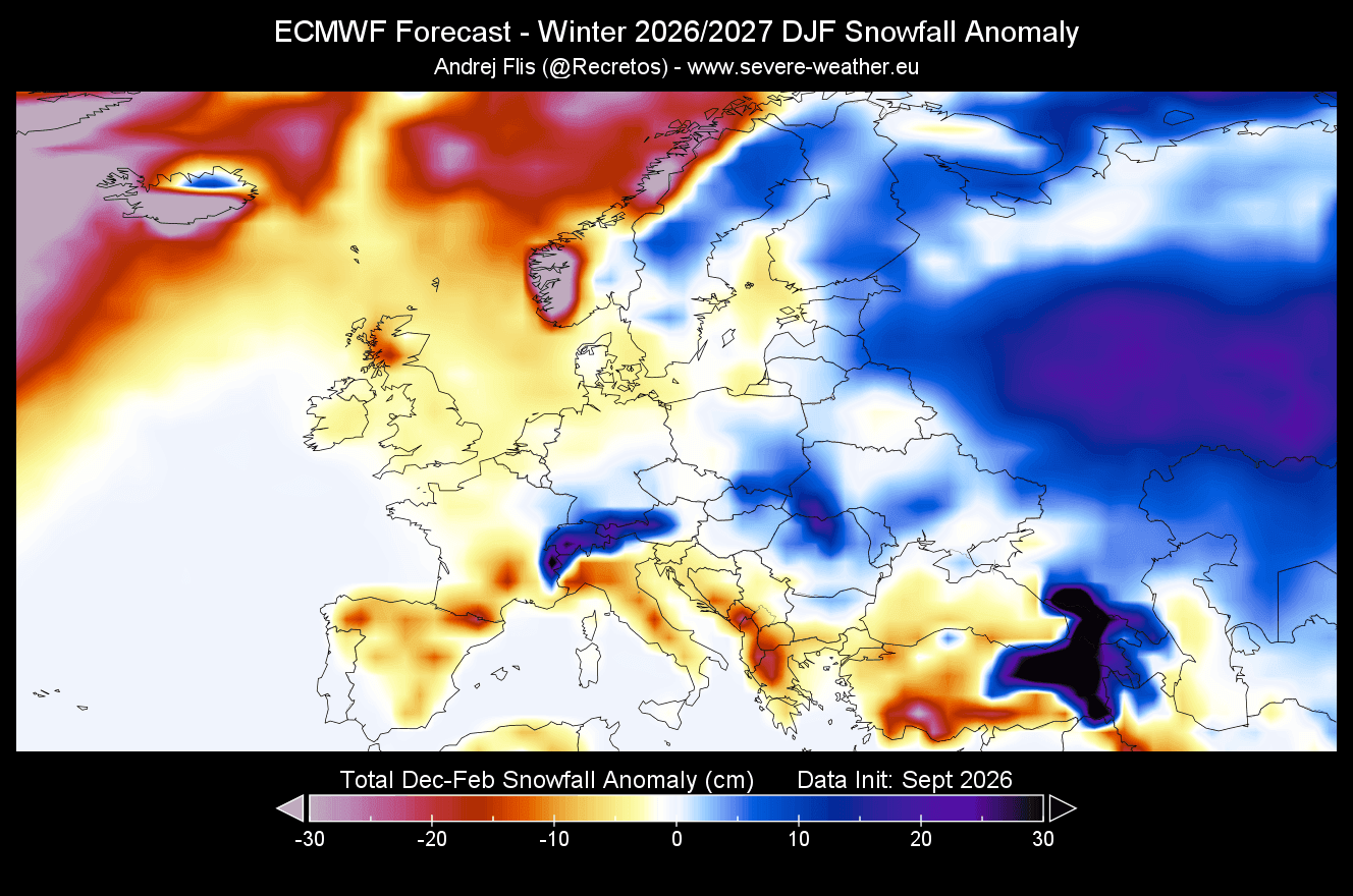
First, we have the seasonal average image for Europe. Overall, the snowfall forecast is not particularly strong, but the September run has improved the outlook. While we still see below-normal snowfall over the far north, northwest, and south-southwest, there are above-normal areas starting to appear in the central parts.
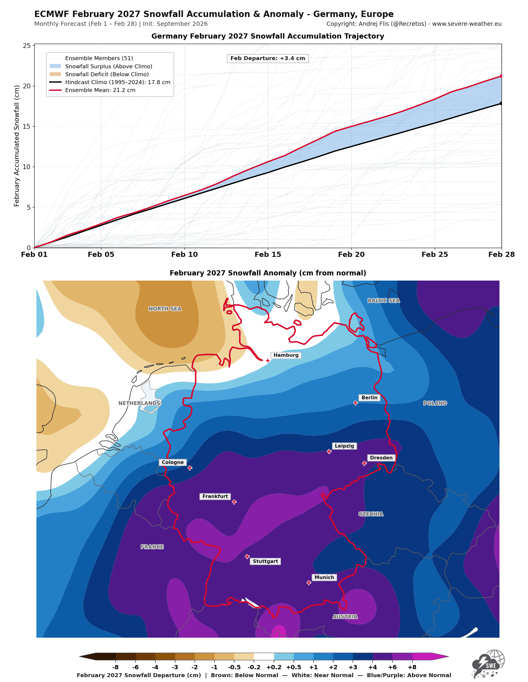
Below is a first quick example of just one monthly forecast map, which you will be able to find in the snowfall explorer below, prepared for individual states, provinces, countries, and larger regions. You will be able to see a full seasonal forecast or a complete monthly breakdown. In this monthly example, you can see a strong snowfall trend for February in central Europe. The red line is the forecast, and the black line is the long-term average.
Over North America, the latest forecast update shows a good snowfall forecast, very similar to the historical El Niño trends above. In the winter seasonal average below, you can see reduced snowfall across the Northeastern and Northwestern United States and parts of western and southeastern Canada. But we can see above-normal snowfall potential across the Central and Eastern United States.
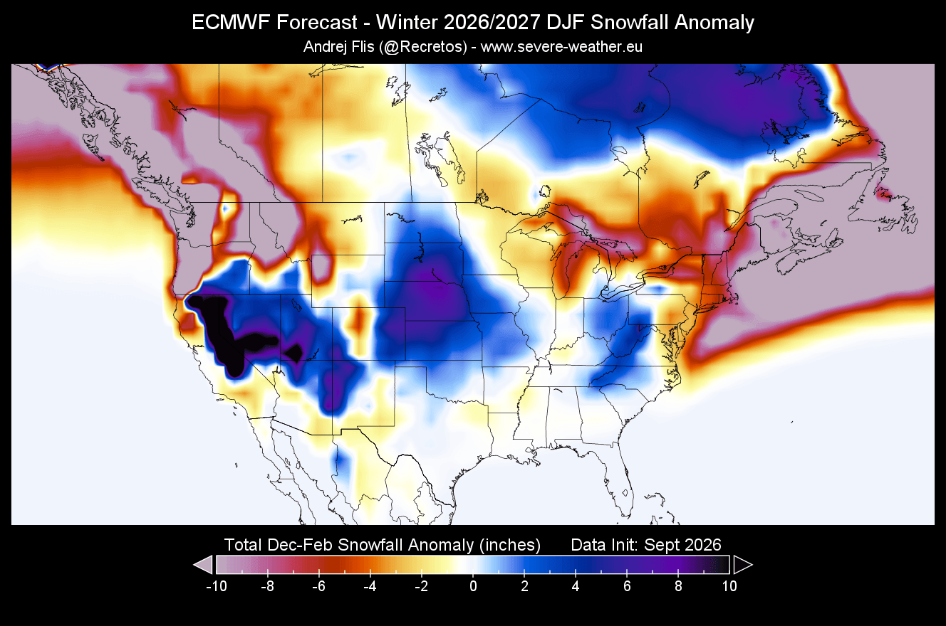
Above-normal snowfall potential is indicated across the Southwestern and Southeastern U.S., the Central Plains, parts of the lower Midwest, and parts to the east. This snowfall track is related to the stronger Pacific jet stream, amplified by the ongoing Super El Niño event.
For skiers, the highest snow potential remains focused across the Sierra Nevada, Utah, and the Central to Southern Rockies (Colorado, Arizona, and New Mexico).
Below is another quick example from the snowfall explorer tool, and it shows the February snowfall accumulation forecast for the Dakotas. In long-range forecasting, images like this are not meant to predict exact snowfall accumulation numbers, but rather to reveal trends in above-normal or below-normal snowfall relative to the 30-year average.
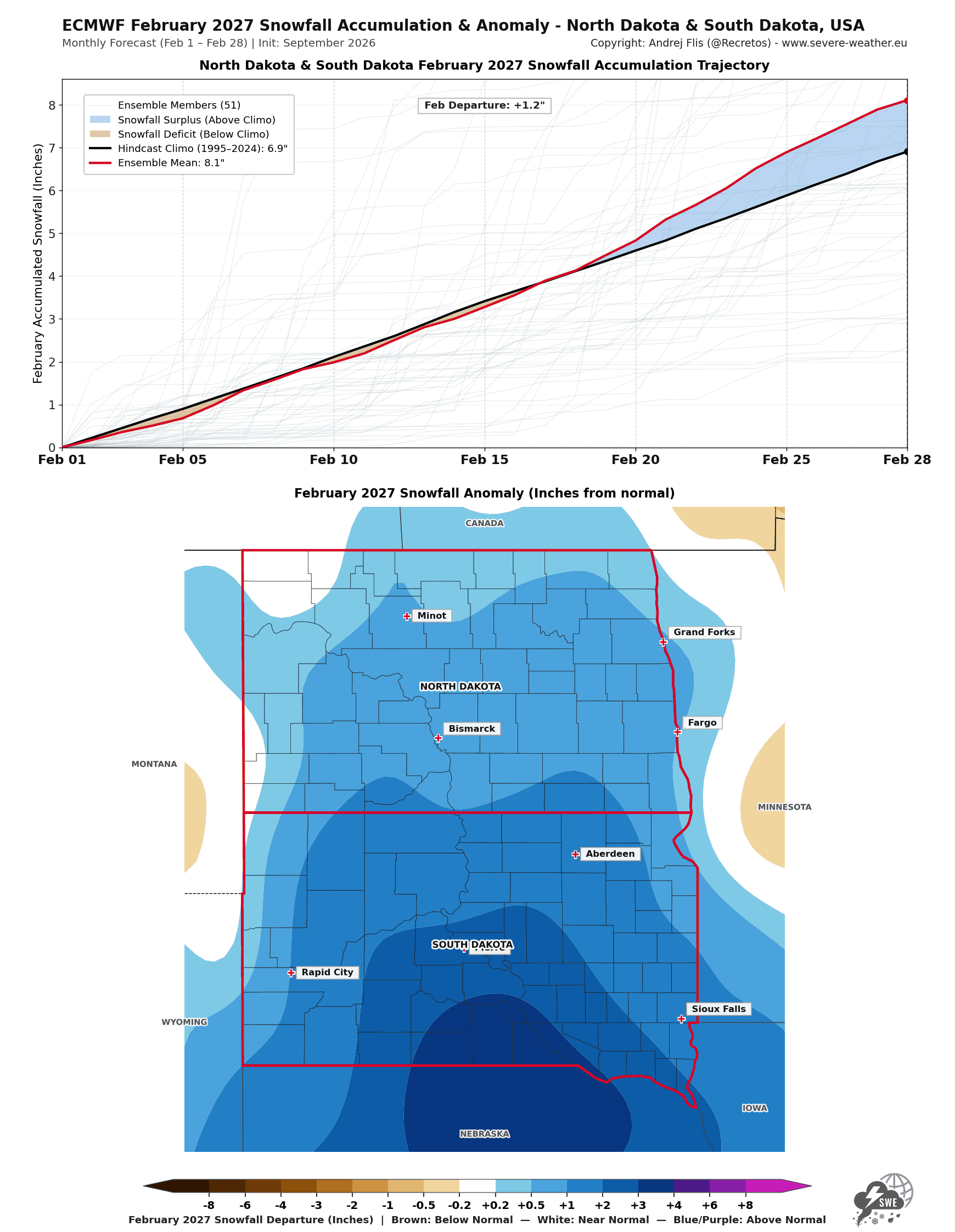
This forecast shows a below-normal snowfall potential over the Dakotas in the first half of February, but the second half is really showing a good above-normal snowfall trend.
Below, you will be able to fully explore these forecast maps and trends for each individual state, province, country, and larger region on a seasonal or monthly breakdown.
Winter 2026/2027 Snowfall Explorer
As promised, here is the full winter snowfall forecast explorer, with maps available for regional or individual state and country coverage. The explorer is designed to be simple and easy to use. On mobile, you can easily pinch-zoom the maps, which are displayed in a detailed, mobile-friendly format and optimized to load smoothly even on slower connections.
How To Read The Snowfall Forecast Maps
These maps are made with simplicity in mind and are mostly intuitive to read. But I still decided to add a short description below, with just some examples, in case it is needed.
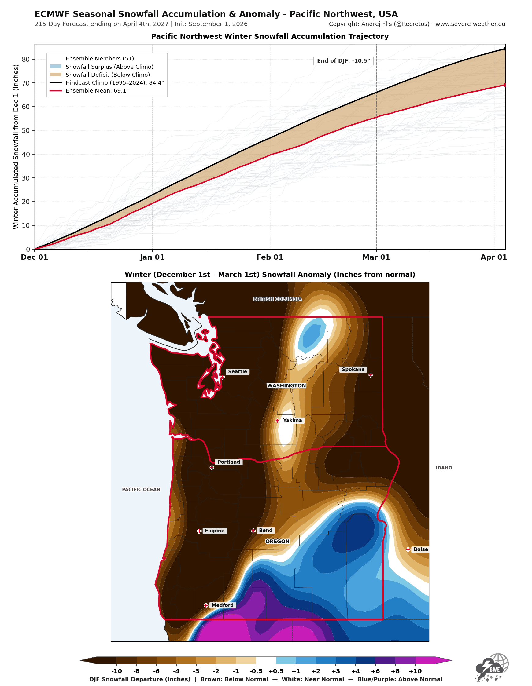
The top plot shows the snowfall accumulation over a season (or a month) for a specific region or individual states/countries. This way, you can nicely see the snowfall forecast trend (red line) and when the forecast shows more/less snowfall during winter compared to the historical baseline (black line). In the example below, you can see an increasing above-normal snowfall total over the whole winter.
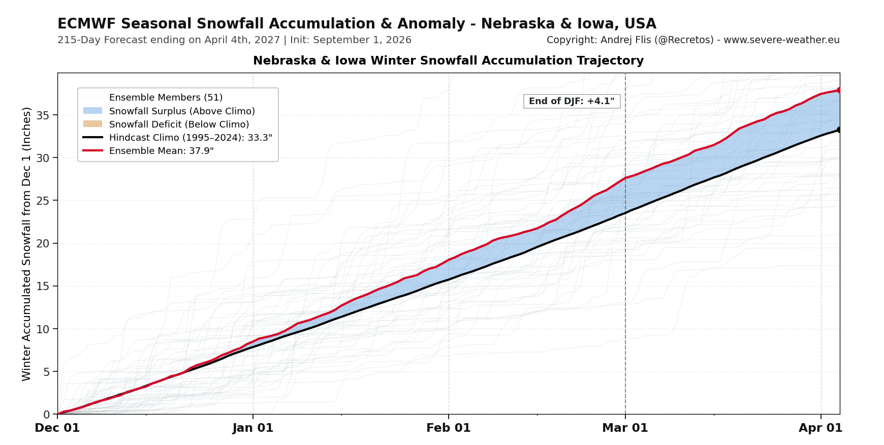
The black line shows a long-term average from the model's own historical baseline. This filters out the model's biases/tendencies, revealing the true atmospheric forecast signal.
Data shows the snowfall total, not snow on the ground. But the raw numbers here are not as relevant on the seasonal scale. What matters here more than anything are the periods of above-normal (or below-normal) snowfall, for example late start versus back loaded snow season.
The bottom panel shows the snowfall anomaly in a full spatial view for the same period as in the graph. So while a graph can show above normal snowfall for the whole region/state combined, there can be a part of the state still left with below normal snowfall, which this map nicely reveals.
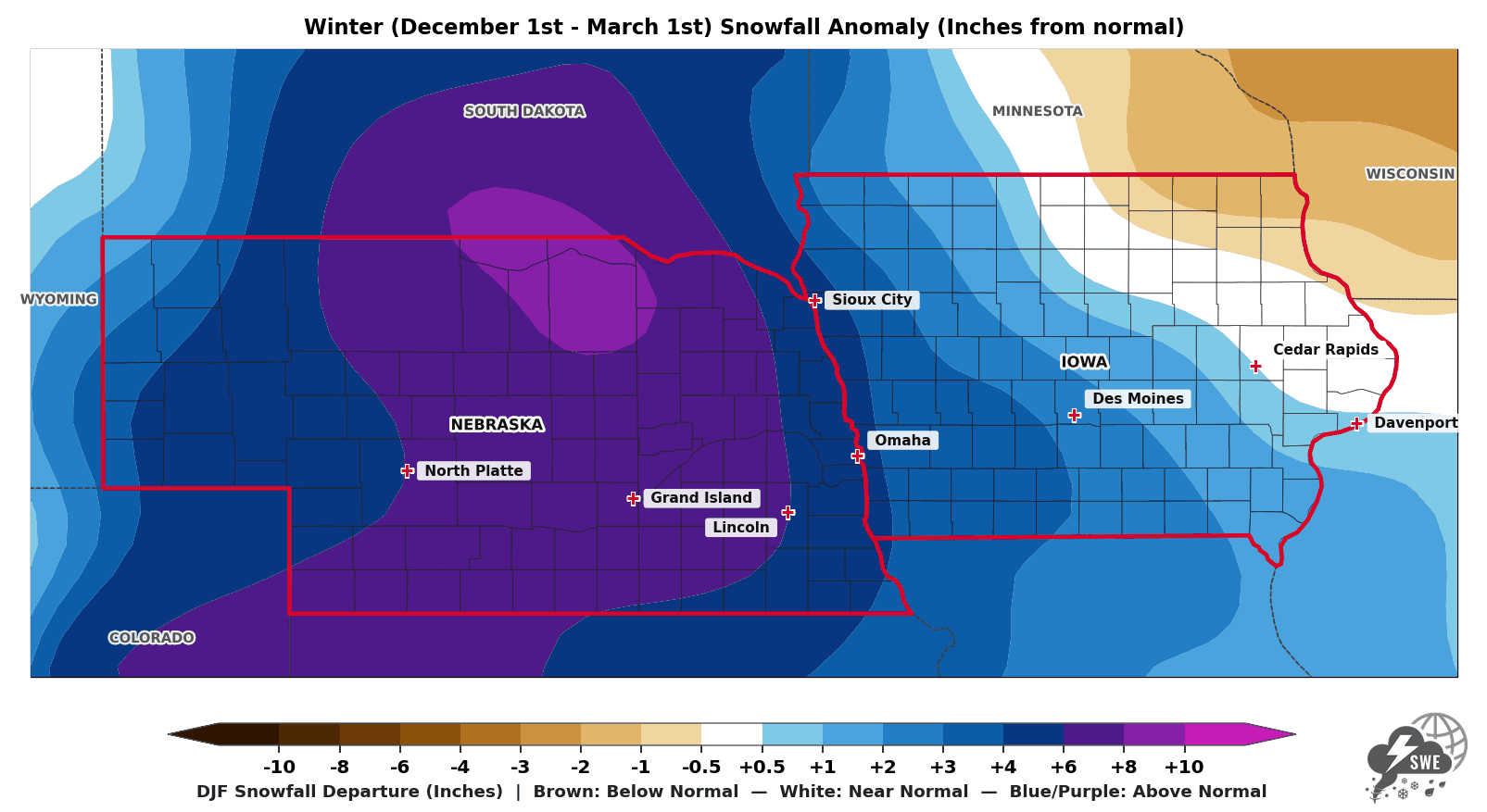
The red outline shows the area from which the upper graph is calculated.
This snowfall explorer will be updated in future articles as new data is available. It will be updated monthly, as we head into Winter 2026/2027, covering the United States, Canada, and Europe, with a full regional and monthly breakdown.
Other image sources used in this article are by CyclonicWX and NOAA-Climate.
Don't miss: A New Polar Vortex Is Emerging Over the North Pole, With a Winter 2026/2027 Disruption Risk
We will keep you updated on the global weather pattern development, so don't forget to bookmark our page. Also, if you have seen this article in the Google App (Discover) feed, click the like or the star button there to see more of our forecasts and our latest articles on weather and nature in general.